Superfish Theming
By Ben Nitkin on
.sf-menu li:hover > ul,
.sf-menu li.sfHover > ul {
left: 0;
top: 1.77em;
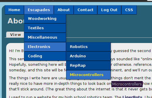
}That little snippet of code's been giving me grief for a month. Well, this one, really:
/*Adjust top to line up submenu with shorter main menu*/
.sf-menu li:hover ul,
.sf-menu li.sfHover ul {
top: 2em;
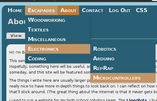
}When I set this site up, I wanted dropdowns. Y'know, menus that expand when you hover them. They were initially provided by Nice Menus. For some reason, some time later (and no, I don't know why), Nice Menus stopped being nice. The dropdown's wouldn't drop.