By Ben Nitkin on
Nitkin.net is a year old. A year and three days, in fact.
Since I set up the domain, I've been using it to document projects - a reprap over the summer, coding games in the spring, a wooden lock, and some really weird stuff. All that writing took a toll on site organization.
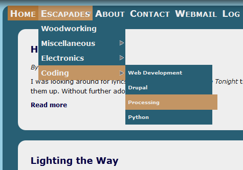
(This post has a lot of big words. Instead of worrying about them, take a look at the brand-new Escapades menu above!)
Back when I started the site, I decided to organize content in three ways:
- Date: This actually fell by the wayside due to technical difficulties, but I'd like nitkin.net/2012 to show all 2012 posts. (Instead, 2012 posts live at nitkin.net/archive/2012.) Archive is a view that collates posts by year and month, but I can't put it on the frontpage.
- Escapades: Posts are categorized by the kind of thing they're about. Woodworking, for instance, or coding. This provides a general idea of topic without filtering too strongly. The name's silly for two reasons. First, I like silly, and second, I needed something that referred to types of projects, but not the projects themselves.
- Projects: Posts are also organized by the specific thing they're about. An drupal theme, for example. Projects is more freeform than Escapades, which is a benefit for filing particular posts, and a disadvantage when trying to read about a topic.
Until recently, both projects and escapades were blocks in the left column. I've grown tired of leaving navigation in a sidebar, so I decided to rearrange. Escapades should be a menu. A dropdown menu.
That was surprisingly easy. I downloaded nice menus from Drupal, read the documentation a bit, and replaced the menus in Bubbly (that's my theme) with a Nice Menu. That was just one line of code.
But the new menus used Nice's CSS, which didn't match Bubbly at all. So I poked it. Repeatedly. Nice Menus lets the user swap its default CSS for another one, so I popped in a new file and changed colors and such until it worked. I'm not sure why the highlight color overhangs the rest of the menu, but besides that, they're working.
I also pulled in taxonomy menu, which creates a menu entry for each item in a taxonomy. Now Escapades lived in the menu!
New problem. In Drupal, a taxonomy is a hierarchy of terms. Escapades looks like this:
- Escapades
- Woodworking
- Miscellaneous
- Music
- Cooking
- Sketching
- Electronics
- Arduino
- Reprap
- Microcontrollers
- Coding
- Web Development
- Drupal
- Processing
- Python
Every article published is associated with one term in Escapades, and one in Projects. Plenty of articles are tagged Arduino, but very few are tagged Electronics, so the page for the latter is barren.
That's bad. My site should be simple to navigate and shouldn't hide content.
Views came to the rescue. (It always does.)
By default, there's a View to emulate Drupal's default handling of taxonomy pages. It lists each article with a given term, sorted by date. Unlike Drupal's default, though, the Views taxonomy pages are customizable, and can be nested one inside of another.
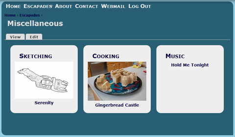
I wrote a view that showed the children of an arbitrary taxonomy entry provided as an argument. It listed each child. Directly beneath each child is its most recent post, including a title and thumbnail. (That's defined as a Relationship, if you were wondering.)
A little CSS-magic later, I made that view mesh with the rest of the site's theme.
Next, I placed the child taxonomy view in the taxonomy list page header. (See image 2.)
It works perfectly! Each taxonomy term list page now enumerates its own children, with eyecandy thumbnails, followed by the nodes filed under that term.

